Brand Toolkit
Our brand toolkit outlines the core elements of our brand, designed to work together to create a unified voice, look and feel for our CNC brand. Our new brand should be used consistently across all platforms and all campuses. When our brand is used in a uniform way, it becomes instantly recognizable and sets us apart in a competitive market.
Logo
Our new CNC logo is the centerpiece of our visual identity. A bold, contemporary word-mark with a mixed case font that feels human and approachable, and speaks to our unique and distinctive character. The bar reflects our connective nature: a bridge between learners and educators, inspiring movement forward, helping to connect people to potential. “CNC” is the most emphasized word within the new logo, raising the bar above it, and sets the bar high for delivery of service and expectation within the region we serve.
Primary Logos
Primary Logo
-
The stacked version is our preferred logo and should be used whenever possible on all official CNC documents internal and external.
-
The horizontal version should only be used when space prohibits the use of the primary stacked version.

Secondary Logo
Our secondary logo can be used internally or on external mediums when it’s unnecessary to spell out College of New Caledonia. It may also be used in certain applications when accompanied with College of New Caledonia elsewhere on the same page (ie: for icons or for social media).
Secondary logo
-
Our secondary logo with enclosure can be used internally when it’s unnecessary to spell out College of New Caledonia and the application prohibits the use of our standard secondary logo. It may also be used in certain applications when accompanied with College of New Caledonia elsewhere on the same page (ie: for icons or for social media).

Our Logo with Messaging
Our new brand gives us the opportunity to replace “Caledonia” with words that represent new experiences found at CNC. Words like: opportunity, perspective, challenges, connections. Our new brand leaves room for growth—growth of our learners, growth of employees, and growth of the College itself—in every community we serve.
So, whether you’re a student, alumni, employee, donor, partner or guest, we invite you to fill in your own blank, and find yourself in the College of new.
This should not be used to replace our logo and should be accompanied by our logo within the layout.
Some Final Thoughts on Logo Usage
We’ve outlined a few examples of things that should not be done with our logo. Remember to always use the primary stacked logo whenever possible.
For a full set of guidelines on how to use our logo, please see Section 2 of our Brand Guidelines document.
Any use of the CNC logo must be approved through the Communications dept before publication of any kind. This applies to internal or external use of any version of the CNC logo and accompanying visual assets. Contact us at brand@cnc.bc.ca for approval.
Colour Palette
Colour is integral to expressing and communicating our visual identity. Our colour palette has been designed for a high degree of flexibility. We can vary the look and feel of our communications simply by changing the way we use our colour palette. We have specific guidelines regarding which colour combinations work well together. See Section 3 of our Brand Guidelines. No other combinations are permissible.
Colour palette
-
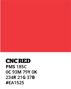
Our refreshed CNC red is an essential part of our brand and heritage. It feels empowering, dynamic and brings warmth to all our communications and should take the lead visually whenever possible. It should always be the most prominent colour.
-
Some Final Thoughts on Colour Usage
We’ve listed some things that should NOT be done with our colour palette. For a full set of guidelines on how to use our colour palette, please see Section 3 of our CNC Brand Guidelines document.
- Don’t introduce new colours
- Use red (PMS 185C) as your primary colour and use other colours within the palette to complement it.
- Don’t use colour combinations that lack contrast. Please see colour combinations that work well together on Page 29 of our brand guidelines, and only use these combinations.
- With the exception of our approved greys, don’t use different tints of any of the colours within our colour palette.
Primary Font
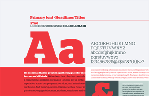
Our primary font, Stag, is classic and contemporary. It’s bold, yet understated, and gives a nod to the long-standing history that CNC has within the region.
Use:
- Headings, some sub-headings and call-outs (in various weights).
Secondary Font
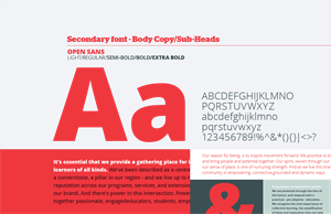
Our secondary font, Open Sans, is a clean and modern sans serif font.
Use:
- Body copy and subheadings to complement our primary font.
- If Stag is not available for use for headers/titles, Open Sans can be used in its place.
See below for instructions on how to download to your computer.
Typography Download
Interested in downloading our primary font Stag? Please contact us at brand@cnc.bc.ca
Open Sans is a Google font and all relevant styles can be obtained for free at: fonts.google.com/specimen/Open+Sans
Some Final Thoughts on Type Usage
We’ve set out some rules on how to use our primary and secondary fonts. For a full set of guidelines on how to use typography, please see Section 4 of our Brand Guidelines.
- Don’t substitute other typefaces
- Don’t make text too big or too small
- Don’t add drop shadows, strokes or outlines
- Don’t kern (letter space) text too tightly or loosely
- Don’t stretch type horizontally or vertically
- Don’t use Stag for body copy or Open Sans for headlines except when Stag is unavailable
- Use variation in type size when appropriate to create a clear hierarchy to messaging
Graphic Device
The Bar in our logo is at the core of our visual identity. It reflects our connective nature, a bridge between learners and educators, inspiring movement forward, connecting people to potential. We look to the Bar to inform our visual language to inspire a bold design element.
The Bar can be used in a variety of compelling ways to bring richness to our visual language. The following images demonstrate the flexibility of the Bar and just a few of the ways it can come to life.
Some Final Thoughts on Using Our Graphic Device
There are a few guiding principles to follow when using our graphic device. For a full set of guidelines on how to use our graphic device, please see Section 5 of our Brand Guidelines.
- Don’t alter or create new graphic devices
- Don’t overuse the Bar. It should never be used more than 1-2 times within a spread
- Don’t force its use. Not all layouts need it, sometimes it’s fine not to use it at all
Photography
Our photography should capture authentic moments of everyday life on the CNC campuses. It shows our passion and northern spirit through connective interactions and the genuine experiences of our students, faculty and community.
We have over 400 photos taken across all campuses and representing the wide breadth of programs and courses offered at CNC. These photos should be used as much as possible in marketing and advertising materials. Stock imagery should be avoided, and only used with permission of the Communications department.
Photography Guidelines
For examples of our photography style, please see Section 6 of our Brand Guidelines.
- Don’t use images that look staged or posed
- Don’t portray unrealistic emotion or scenarios
- Don’t use clichéd metaphors
- Don’t use obvious post-production or Photoshop effects
- Don’t use images that are obviously not northern BC (however, there are some exceptions including imagery used in the context of International Education, Study Abroad, Field Schools/Study)
- Don’t use images that are culturally insensitive
- Always include the description/accompanying caption for the photo when possible.
CNC Photo Access
For permission to use a CNC photo or instructions on how staff can access CNC photos, please contact us at brand@cnc.bc.ca.